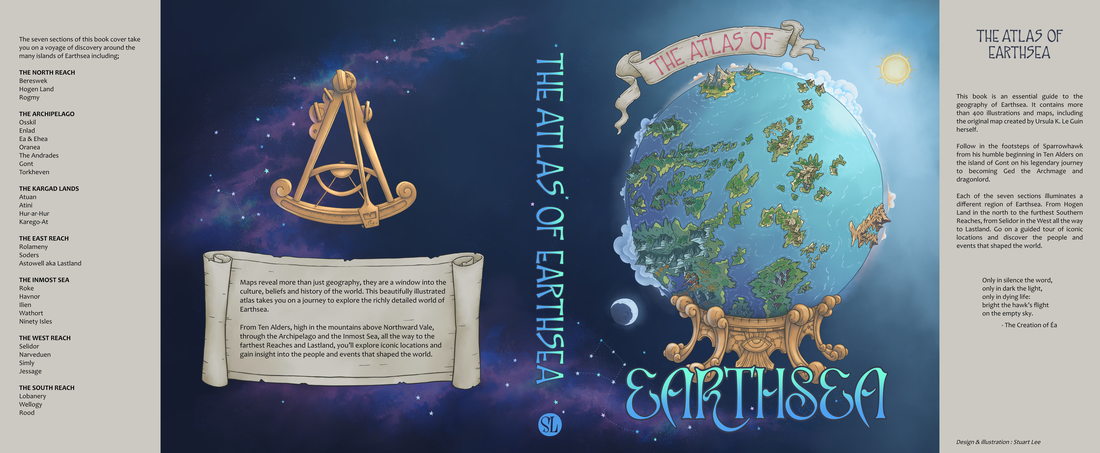
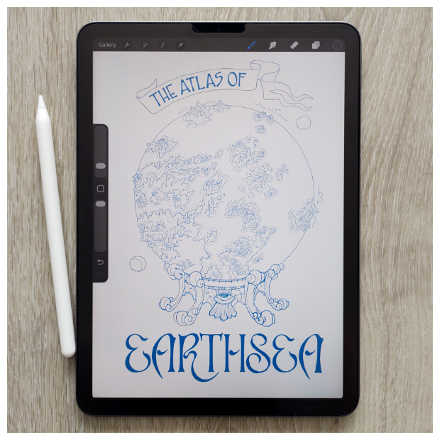
The Atlas of Earthsea
Illustration / Lettering / Design
I’ve always been fascinated by maps and enjoyed looking at atlases. As a video game developer I created many maps over the years as guides for level design and world building. After reading the Earthsea series by Ursula K. Le Guin, complete with a world map in the front of the book drawn by Ursula herself, I started to imagine what a whole atlas of Earthsea would be like with all it’s islands and iconic locations from the stories. I wanted to do a project about maps, and this would be the perfect opportunity to combine a map with a book cover.
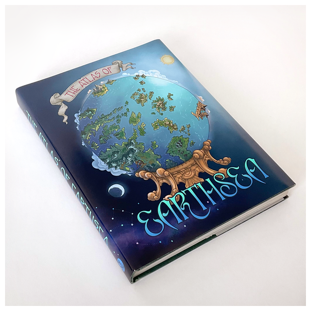
I decided for this project I’d bring it to life by re-covering a physical book, so I set off to a local second hand bookshop to see if I could find something suitable to use. I came across a wonderful old booked called “The fascinating secrets of oceans & islands” and even if no one else would see the inside pages, it seemed like the perfect candidate.
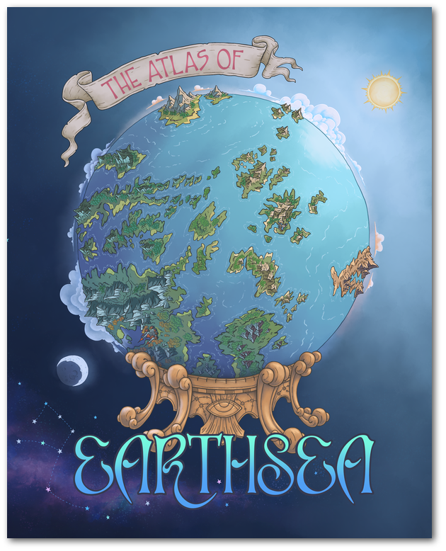
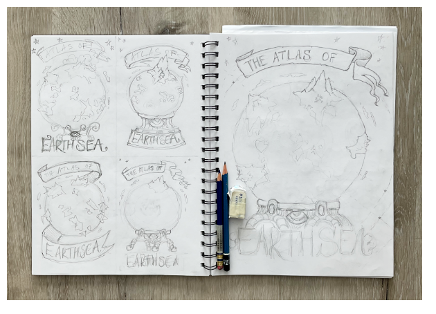
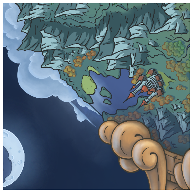
I had the main concept in mind from the start – a globe with the lands shown on it being 3D so that the mountains would stick out beyond the surface of the sphere, giving it an extra fantastical dimension. I could then push this even further with clouds and the sun and the moon floating above the surface, so the world was expanding out from the globe, just like how the world of Earthsea jumps out off the pages of the books when they are read.
I tried a few layouts using the globe idea, and decided on the one where the globe is on a stand, like a crystal ball, which is a nice parallel with the idea of looking into a book like a window into another world. The stand would also allow me to add in some extra details that link back to the books, especially the eye motif that is a reference to Ged the Archmage’s boat Lookfar.
“We called the boat Sanderling, but do you call her Lookfar, and paint eyes aside her prow, and my thanks will look out of that blind wood for you and keep you from rock and reef.”
A Wizard of Earthsea – Ursula K. Le Guin
Once I had the template measured out from the old dust jacket, I set up a new document in Procreate on my iPad and dropped my rough sketch into it. I used the original map illustration by Ursula as a guide to draw in a section of the world, taking care to have some mountains at the edges as much as possible, and include a few of the most prominent places from the novels. The mountainous island of Gont is just north east of the centre of my globe, with Bereswek along the top edge, The Kargad Lands just visible on the east edge and the large island of Havnor on the south west side. I tried to stay as true to the original map as possible, taking in to account some curvature of the globe, and a little upscaling so I could include some extra details including some small buildings for the port of Gont and towers of the Great Port city of Havnor.
“The towers of the city are built of white marble. The house of every prince and merchant has a tower, so they rise up one above the other. The roofs of the houses are red tile, and all the bridges over the canals are covered in mosaic work, red and blue and green.”
Tales from Earthsea, Ursula K. Le Guin
After making some adjustments to the layout, scale and position of the elements, I did the final line drawing before going on to the colouring stage. With the sun and moon featuring in the illustration, I knew I had to show the lighting coming from those two sources on the globe world below them. I divided the globe into sections like a pie so I could get the angle and direction of the lighting correct. This is where a bit of artistic license comes in, to strike the balance between looking good and being believable.
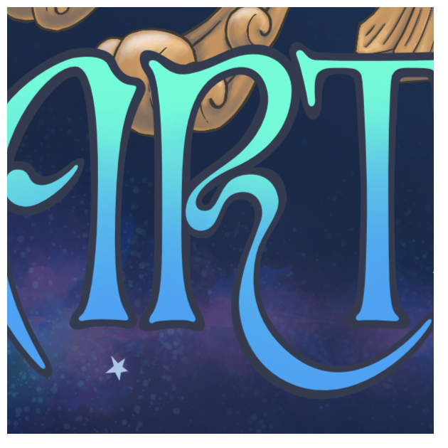
For the spine and back cover, I continued the illustration as a single wrap-around piece which extends off into space with a background of nebula, stars and some constellations picked out including the constellation of Gorbardon – the rune Agnen which is included on a map Ursula drew for The Farthest Shore.
Early versions of the back cover included a compass, which I ended up replacing with an Octant – a device that measures the altitudes of celestial bodies such as the sun or moon and was used on ships to aid navigation. Although not mentioned in the books, I thought it was very fitting in the context of the overall cover design, and also a good shape to carry over the eye and stylised wave motifs from the globe stand.
The title lettering is all custom, hand drawn for this cover. I wanted to make a nice curvy design for the “Earthsea” lettering, inspired in part by Art Nouveau curves and forms, which echo the waves of the ocean. I sketched out the letters on paper in my original design, and then refined that for the final version in vector format. It’s important to me for my work to be hand drawn and ‘made by a human’ (especially when I’m using digital tools) so the outline around the lettering is also hand drawn with the slight variations that come with that, rather than a default ‘outline edge’ generated by the software.
It was a fun and challenging project, to stay true to the wonderful map Ursula K. Le Guin created for the first novel, but also add my own stamp to it and expand from that starting point into something new. I hope anyone seeing my imagined atlas will be able to recognise the world depicted on the cover and maybe those that haven’t already will be inspired to start their own reading journey around the world of Earthsea.
Only in silence the word,
only in dark the light,
only in dying life:
bright the hawk's flight
on the empty sky
- The Creation of Éa
The Word of Unbinding, Ursula K. Le Guin